How To Build A Text Editor Like Notion | The Startup
Slash commands are a building block in Notions text editor.
Without a doubt, Notion.so is one of my favorite apps when it comes to organizing notes. I love their minimal designed text editor because it focuses your attention on the content — and not on unnecessary UI elements.
Yet it provides you a ton of powerful features that lead to a better writing experience.
For instance, the slash command is one of those features that really enhanced my writing flow. It allows you to add and style content without leaving the keyboard. Instead of clicking a UI button to add a new heading, you can just type , hit ‘Enter’, and there you go.
Another cool thing about Notion is that it is a fully web-based application. Because of that, I was interested in how it was actually built — especially the text editor. In fact, I realized that it is not that difficult as I expected it to be.
In this article, we take a closer look at how a text editor like Notion works and how we can build one ourselves with React.js.
By doing this, we will discover and learn some essential frontend skills:
- Working with the DOM and its Nodes
- Working with Event Listeners
- Advanced State Management
Here is how our application will look like in the end. In my opinion, a perfect project for your portfolio if you are new to React.
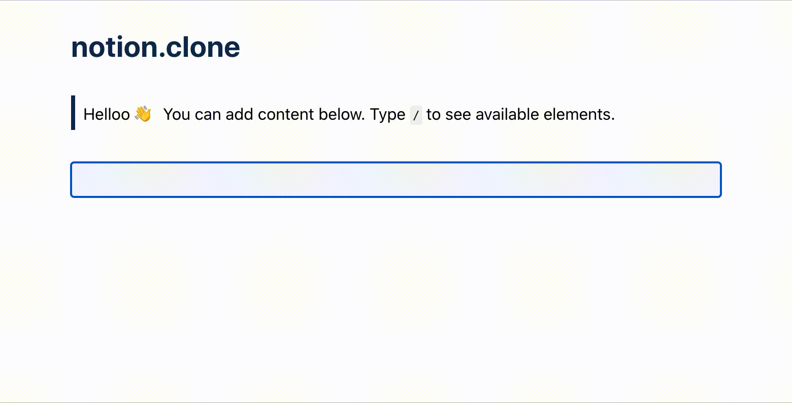
The final application!
The Theory: How Does A Notion-like Text Editor Work?
Editable Blocks
The core concept of a Notion-like text editor is what I would like to call blocks. Each time you hit ‘Enter’ on your keyboard, you create a new block. So essentially, each page consists of one or many blocks.
From a user perspective, a block contains content and has a specific styling that is associated with the block type. Types of blocks could be headings, quotes, or paragraphs. Each of those has a unique styling.
From a technical perspective, a block is a so-called element. Nearly every HTML element can be turned into an editable one. You just have to add the attribute to it. This indicates if the element should be editable by the user. If so, users can edit their content directly in the HTML document as if it would be an or element.
The concept gets clear in an example:
Let’s say a user adds a new block with the type of Heading. This produces the following HTML output:
Since the user selected Heading as the block type, we append an element to the DOM. Thus, it gets an appropriate heading styling. The user could now directly edit the content of that element by placing the cursor inside it.
Slash Commands
Now that the user can add new blocks to the page by pressing ‘Enter’, how can he/she determine the type of an added block?
In Notion, you can do this via slash commands.
The concept of slash commands is simple yet effective. Every time you type a inside a block, a type-ahead menu pops up right above the cursor. This menu shows you all available block types. As you write along, you filter the block types with your query. If you found the right block type, just hit ‘Enter’, and the block turns into whatever you selected.
In our application, all slash commands will be equivalent to the corresponding HTML elements. Meaning an command turns into an H1 heading and a command turns into a paragraph, for example.
Technically, an existing block like would consequently turn into once the user types and hits ‘ Enter’.
The Practice: How Can We Rebuild It?
Now that we know how it works in theory, let’s put it into practice. First of all, we create a new React project. You can do that by using create-react-app or any other tooling.
1 —Create An Editable Page
Having the setup done, we create our first component:
The page component stores and renders all blocks we will create later on. As a start, we only provide an initial first block that we define at the very top. This block will turn into an empty paragraph element once we created our editable block component. For now, we just render a plain container.
Note: Since every block needs a unique ID, I created a helper function that we can use for initializing new blocks. In case you want to use the same function:
2 — Create An Editable Block
As a next step, we create an editable block component that we can render instead of the container. For that, we have to install an external dependency called .
React-Contenteditable is a package that makes working with editable elements in React really easy. It abstracts a lot of complexity for us so that we only need to pass the right props to the component. The component exposed by the package then handles the rest.
To install the package, run
Next, we create a new file called :
The editable block renders the component that we imported from the package. By passing and as props to the component, we can define what should be displayed and how it should be displayed. Remember, the defines the HTML element type and hence the styling.
If we were to change the block type later on (e.g. from to ), we can simply update the prop. Pretty easy, right?
We also added advanced state management to the block component. When the component mounts, it receives the initial HTML content and tag via props and stores them in the state. From now on, the block component fully owns the draft state. Any subsequent changes to the or prop are being ignored.
When there have been relevant updates to the or state property, we update the page component’s state in the lifecycle hook too. Thus, we avoid an unnecessary re-rendering of the page.
Having our component set up, we can finally use it in our page component:
Besides using the component inside our hook, we additionally added new methods in the page component:
- The that we already use in our block component takes care of keeping the page and block state in sync.
- The appends a new block and sets the focus to it.
- The removes a block and sets the focus to the preceding block.
We pass all three methods as props to the editable block.
Note: In the , we use another helper function that manually sets the cursor to the end of the block content. If we would just focus the element as we did in , it would focus the element though, but with a cursor set to the very beginning of the block content. In case you want to use the same helper function:
3 — Implement A KeyDown Listener
So far, we can only add text content to our initially added block. Let’s make things a bit more interactive with our first event listener. This will allow us to add and delete blocks as we like.
Inside , we create an method that we pass on to the component:
As mentioned, this event listener is primarily responsible for adding and deleting blocks. But let’s break the down bit by bit:
- Regardless of what key has been pressed, store the key in the state. We need the to be able to detect key combinations.
- When the user pressed , we store a copy of the current HTML content in the state. We do that because we want to restore a clean HTML version after the user has finished the process of selecting a block type.
- When the user pressed , we prevent the default behavior (i.e. adding a new line). Instead, we create a new block by using the method which we previously created in the page component.
- Because the user should still be able to add new lines somehow, we use the state property to detect a key combination. If that is the case, we do not add a new block and allow the default ‘Enter’ behavior to happen.
- Lastly, we delete an empty block when the user presses with the method.
So far, we can create and delete blocks.
Now that we can create new blocks, what about slash commands and selecting different block types? We cover that in the next steps.
4 — Add A Select Menu
As mentioned earlier, when the user types a , we want to display a select menu. The menu shall list up all available block types. A specific block type can then be selected either by clicking on it or by typing in the matching slash command.
To implement such a select menu, we first have to add another dependency: match-sorter. This is a simple package that helps us with querying the matching block types.
To install it, run:
Having that done, we create a new file called with the following contents:
At the very top, we define what block types should be selectable by the user. Each type has a tag and a label: the tag defines which HTML element type shall be used and the label defines the display name inside our menu.
When the component mounts, we calculate the position of the menu on the screen inside our hook. There, we use . This object contains the current position of the cursor since we want to display the menu right above it.
Additionally, we attach a event listener in the hook. It takes care of storing the entered command in state and enables the user to select a block type via keyboard.
Whenever the state property changes, we run our imported function to filter for matching block types. Thus, the select menu shows only block types that match with our command.
Finally, when the user hits ‘Enter’ or clicks on an entry, we execute an method that we receive via props.
Admittedly, this was a lot of code at once. But if you go through it step by step, it should be understandable hopefully.
5 — Add Block Type Selection
Next, we can put things together. Since we have our select menu component in place, we can add it to :
First, we import our component and render it conditionally. We can control its visibility by our state property . If we set this to true, we render the menu additionally to the component.
Next, we implemented the logic that defines when and where we want to show it.
We defined two methods that handle the menu’s opening and closing. When we open it, we first get the coordinates of the currently set cursor. We do this because we want to open up the menu right above the cursor. Lastly, we store this position in the state, set to true, and attach a click listener.
The click listener is responsible for closing the select menu once there has been another click on the screen — no matter if it was on the menu itself or outside it. Both actions should close it.
Our method then is fairly simple. We just reset our previously set state properties and detach the click listener again.
Having the opening and closing handlers implemented, we also need to define when we actually want to open the menu.
From a user perspective, we want to open the menu once the user enters a . Therefore, it seems intuitive to add the call in our previously defined method, right? Because there, we already check if the user pressed the key.
In fact, we have to add another event listener for that. The menu should only show up once the user releases the key. Otherwise, the positioning of the menu would not work correctly. Hence, we add a new event listener for that.
Now there is only one final step to take. Remember that we pass an function as a prop to the select menu component? To make the selection process work, we have to define an associated method for that in our editable block component.
Gladly, this method is rather simple. In the , we receive the selected block type as the argument. With it, we can update our state property as well as restore the HTML backup, i.e. the HTML content without the entered command.
If that process has finished, we set the cursor to the editable block again and close the menu.
And finally, believe it or not… we are done 🎉
Note: I again used a helper function for obtaining the cursor coordinates. If you want to use the same function, here it is:
Ideas For Further Development
Now that we have the core functionality of Notion’s text editor rebuilt, we have a perfect foundation for further development. There are many features that we can add to our application to improve it further.
I always like to look for inspiration in existing apps and see if I can build their features on my own. Same with Notion. Here are two concrete examples:
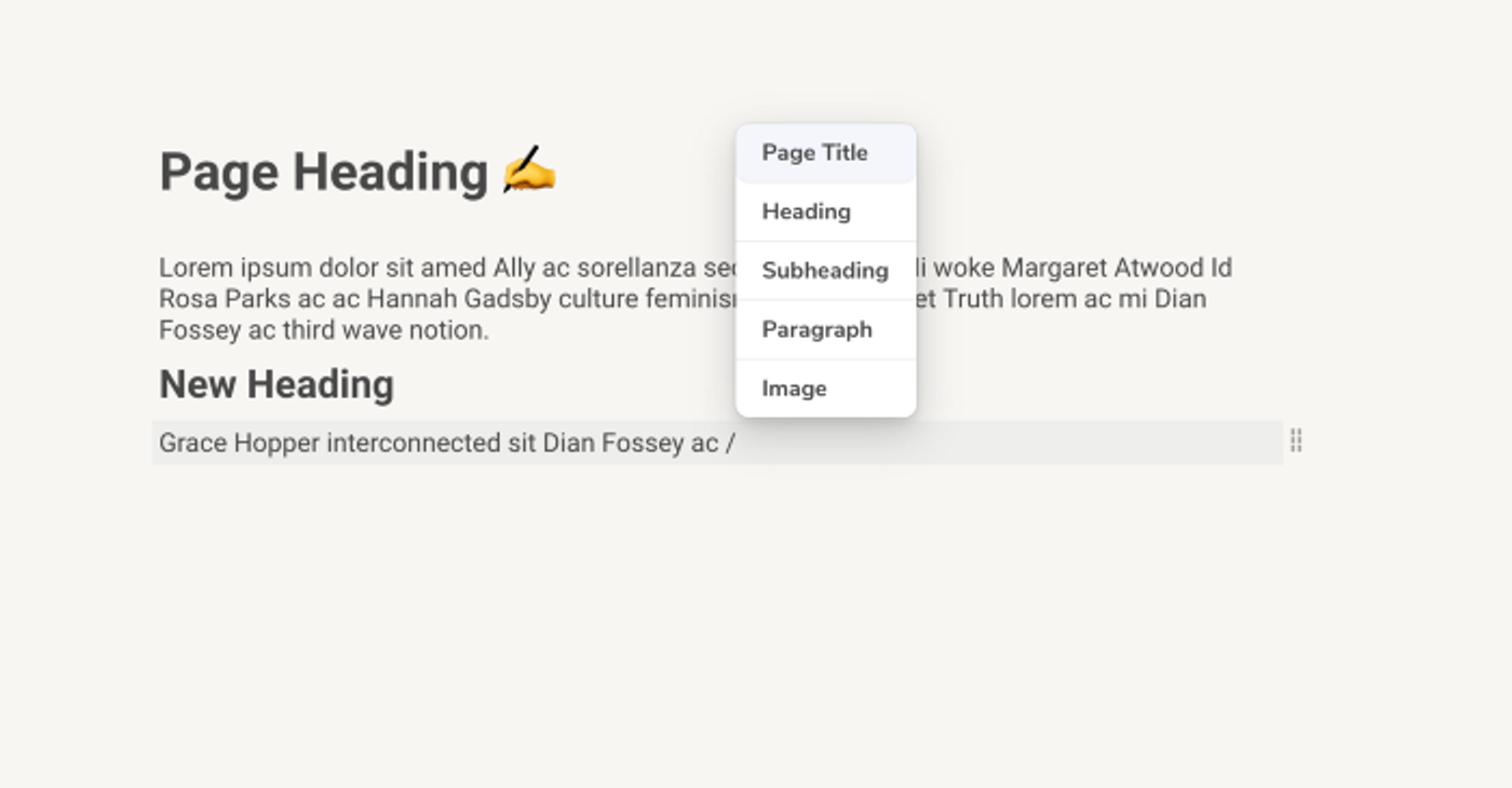
Context Menu Based On Selection
So far, we only show a select menu when the user types a . But what if the user wants to quickly edit the type of an existing block? Or he/she wants to remove a block?
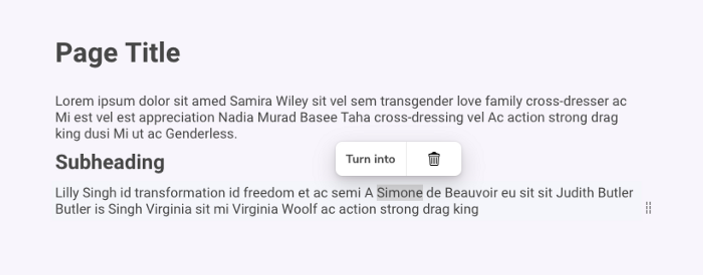
Context Menu that will pop up once the user selects content
Here, a context menu comes in handy. Whenever the user selects the block’s content, we display a menu with two options: either turn the existing block’s type into another or delete the block itself with a single click.
Rearrange Blocks By Drag and Drop
Because we have an underlying block structure, we can rearrange our content fairly easily. Maybe a user realizes that this one paragraph should be further at the top of the page. In Notion, you can easily reorder blocks with a smooth drag and drop functionality. And we can do that too!
Drag And Drop functionality to reorder blocks
Resources
Admittedly, we covered a lot in this article… but I think the idea and process of building a Notion clone are really cool and exciting, especially for React beginners. Therefore, I wanted to provide you all the things you need.
Final Application
You find a working example for the final application on CodeSandbox. It also includes all of the CSS stylings which we did not cover in this article.
Advanced Application
Moreover, if you want to enhance your application with more features (e.g. features like those I mentioned in the last section), have a look at my more advanced application. It might be a good source of inspiration too.
This advanced Notion Clone also includes a backend part that persists the user content on a server. Great if you want to get in touch with basic CRUD operations in Node/Express!
Live Demo: https://notion-clone.kmuenster.com/
Github Repository: https://github.com/konstantinmuenster/notion-clone
Working With The Cursor In The Browser
As you noticed, I used some helper functions in our application. These functions primarily help us to work with the cursor in the browser, e.g. obtaining the cursor coordinates.
Since this was something I struggled with a lot during development, I recently published an article about it. In case you want to dive deeper into this topic, here it is:
As always, thanks for reading! If you stumbled with any questions or issues throughout this article, let me know in the comment section. Thus, I can update and improve the article if needed. I appreciate any feedback!